Negative delta tells you somebody is being aggressive. It does not tell you they are winning.
Aggression is immediate. Control is established only when that aggression produces price progress and continues to produce it. A tall red delta bar is often treated as a verdict. It is a measurement of effort, and effort matters only through the result it produces.
What follows is the Wednesday, 22 July 2026 session in Gold and Silver, worked forward as it developed. The two instruments absorbed the same pressure at the same moment and gave different answers. That difference is where the session becomes useful.
Part I: Two Branches
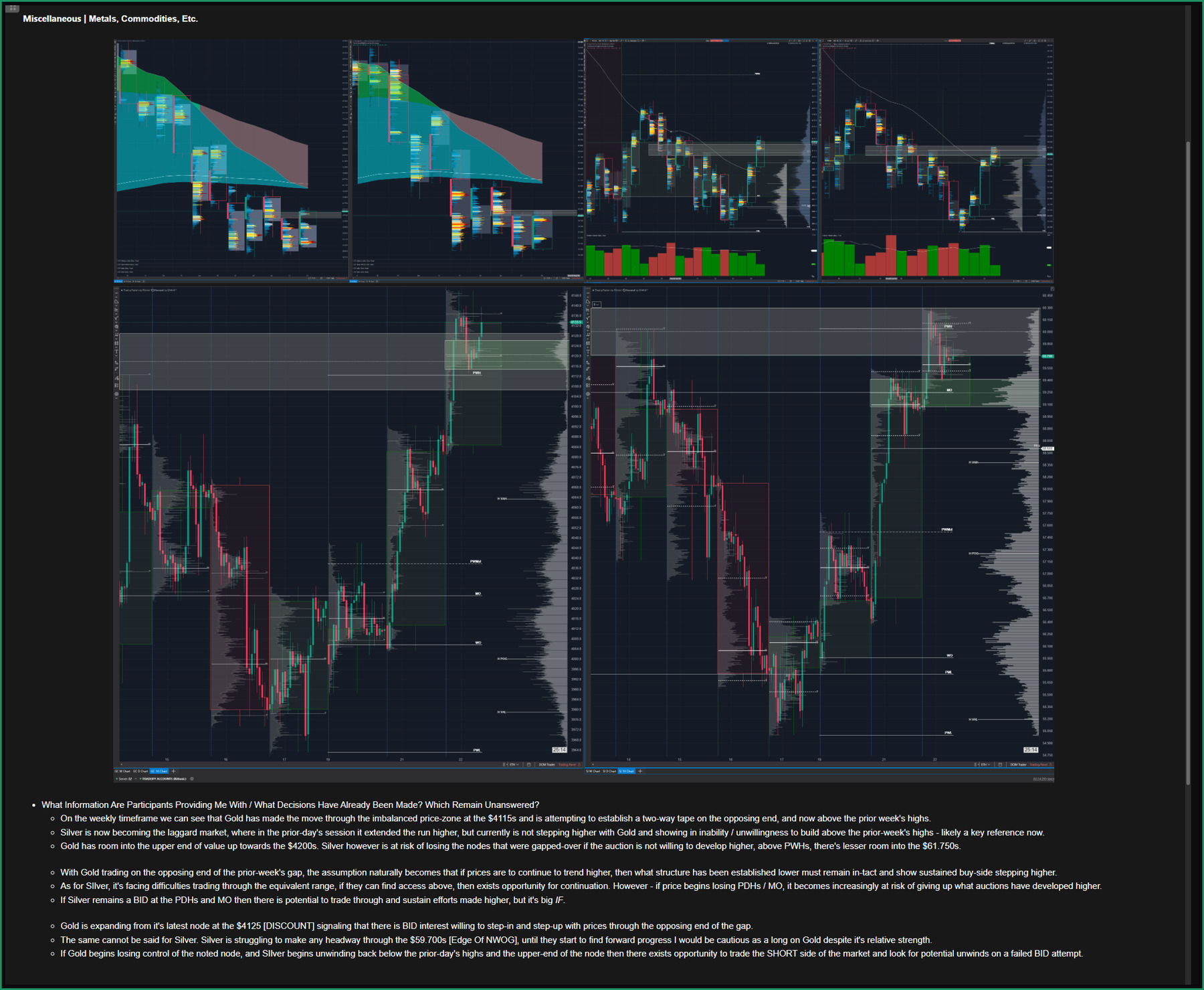
Figure 1. The actual pre-session note. Gold's charts, top left, show price having moved through the imbalanced zone near 4115 and working the far side of the prior week's gap. Silver's charts, top right, show the overnight extension already given back. The written analysis beneath states both branches directly: continuation requires the lower structure to hold and the bid to keep stepping up through it, while a loss of the noted Gold node paired with Silver unwinding beneath its prior day's highs turns the short side into the thing to watch. The note also flags room into the low 4200s on Gold against a narrower path into the high 59.700s on Silver, and states plainly that Gold's relative strength alone did not yet justify a long, pending Silver's confirmation.
The rest of this briefing is for readers on the list.
Free, permanently. Enter your email and a link comes back that unlocks every piece on the site, current and future.
The session did not begin with a forecast. It began with conditions.
The pre-session note laid out two paths. If prices were going to continue higher, the structure built underneath had to stay intact and the bid had to keep stepping up through it. If instead Gold lost control of the node it had most recently built, and Silver unwound back beneath the prior day's highs, then the short side became the thing to work with and a failed bid attempt became the thing to look for.
Attached to both was a caution that turns out to matter later. Silver had not made forward progress through its own overhead area, and until it did, being long Gold carried an unresolved question no matter how much stronger Gold looked.
The purpose of writing both branches was not to cover every possible outcome. It was to prevent initial relative strength from becoming a commitment to the long side before the tape supplied evidence. Nothing was predicted. What existed was a set of conditions, and the auction then revealed which condition became relevant.
Part II: The Same Move, Two Answers
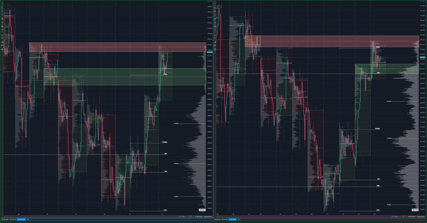
Figure 2. The hourly view, captured as it actually sat at the open. On Gold, left, the shaded band marks the prior week's high zone, with price trading confidently above it and the marked node visible just beneath the current bar. On Silver, right, the same reference sits above current price, the overnight spike already retraced back through it. Both panels carry the same set of persistent levels, the prior day's high and low, the prior week's high, low, and midpoint, and the monthly and weekly opens, which is what makes the divergence readable at a glance rather than requiring a memorised sense of where each instrument closed last week.
By the regular session open the two instruments were in visibly different places.
Gold had cleared the prior day's highs at 4088 and 4091 overnight and was trading above the prior week's high zone with room in front of it. Silver had surrendered the overnight extension and returned beneath the prior week's high at 60.00, while remaining above the prior day's high near 59.55.
Those references come from a levels tool we built to carry the prior day's, week's, and month's opens, highs, lows, and midpoints forward onto the working chart. The underlying references are familiar. The advantage comes from keeping them persistent, organised, and readable inside the same decision environment, so every intraday move can be evaluated against areas the market has already accepted, rejected, or failed to sustain.
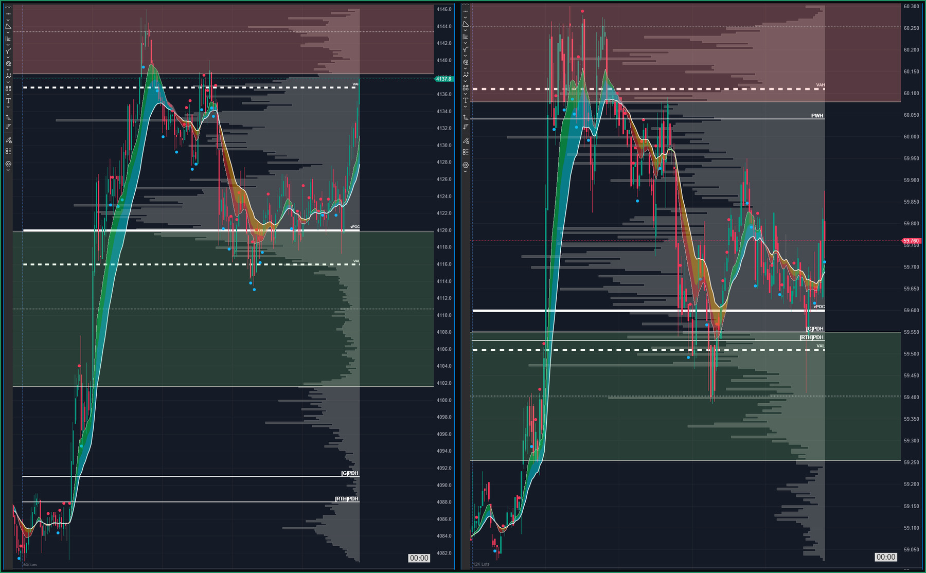
Figure 3. The five minute view of both instruments, profile and pivot ribbon visible on each. On Gold, left, the volume profile shows a distinct node in the low 4120s where the ribbon flattens and trade visibly clustered, with a noticeably thinner band directly above it running into the value area high. That thin band is the location the piece keeps returning to. On Silver, right, the profile shows price sitting on the prior day's high with the prior week's high still overhead, unclaimed. Nothing here is a level to transact against. It is a map of where the auction has already done its work and where it has not.
The session profile added the second layer. Gold's most recently built node topped out in the low 4120s, and that upper edge was the last place the auction had built meaningful trade before the leg that carried it into the open. Above the node, between roughly 4126 and the value area high, the profile thinned out considerably. Price had passed through quickly and left very little behind.
A thin area like that is not support in the traditional static sense, but contextually it often behaves as a supportive zone because it was created through aggressive buying and a lack of meaningful sell-side participation. When price revisits it, sellers frequently diminish or dry up, and buyers can re-engage and rebuild inventory at higher prices. That is also why it becomes a useful area to lean against: decisions tend to be made quickly there, and if the broader trend is intact, it can produce sustained follow-through rather than prolonged two-sided trade.
Gold was the stronger expression of the move and Silver was the weaker one. That is a reason to prefer one instrument over the other. It is not a reason to be in either of them, a distinction that market commentary routinely collapses.
Part III: Aggression Without Progress

A post from President Trump, timestamped 8:56 a.m., stated that any further Iranian strike on shipping in the Strait of Hormuz would be answered by the destruction of a bridge or a power plant, Tehran not excluded.
Into the 9:00 a.m. window, a headline-driven repricing took both instruments sharply lower.
A geopolitical headline hit the tape and compressed decision time immediately. In that kind of environment, the market is not working through the full macro significance first. It is reacting to the nearest shift in risk, with liquidity thinning and participants forced to adjust before conviction has time to form. Aggressive sellers pressed Gold out of the open and down into the thin area. Silver went with it.
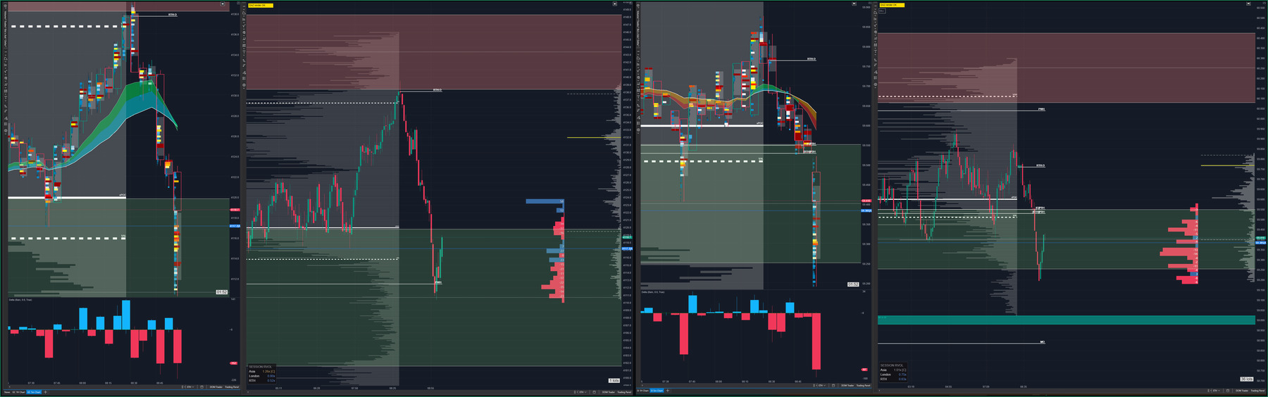
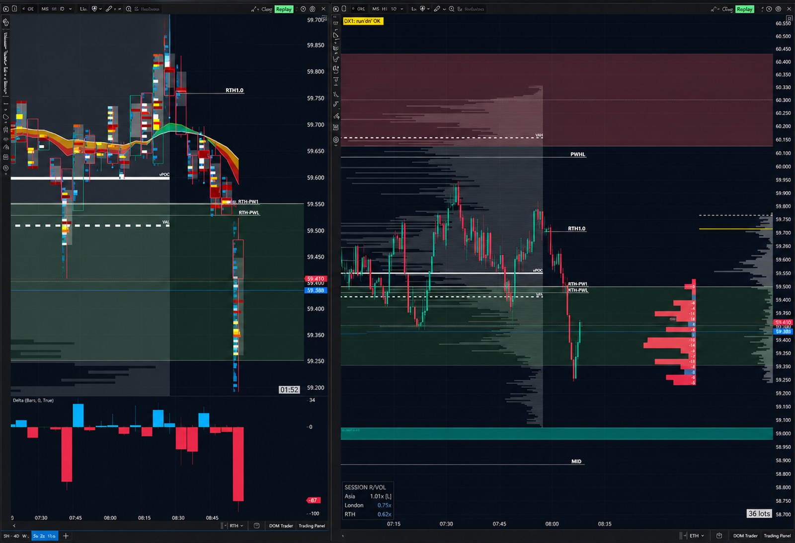
Figure 4. The press itself, Gold above and Silver below. The footprint heatmaps on the left show where volume transacted inside each five-minute candle as price moved lower. The delta histograms beneath them show the aggregate result clearly: large negative five-minute delta bars developed in both instruments as aggressive sellers pressed. On Gold, meaningful volume continued trading inside the tested pocket without producing equivalent downside progress. On the structural chart, the leg-to-leg delta profile shows negative delta bins accumulated lower before positive bins began developing above them as the responsive bid started turning initiative. Silver initially continued lower, but its subsequent recovery carried price back above a large block of negative leg-to-leg delta, leaving much of that sell-side activity underwater. Gold produced the earlier and cleaner answer.
The five-minute delta histogram beneath each footprint showed exactly what the sell-side press looked like in aggregate. A sustained run of negative bars replaced the positive sequence that had carried the markup. Aggressive selling dominated the five-minute candles in both instruments.
The first piece of information that changed the picture came from participation rather than direction. Our session relative volume tool measures current activity against the historical average for that same session window rather than against the day as a whole, which matters because overnight and regular hours are not comparable and averaging them hides more than it shows. It read Gold's regular session at 0.52 times normal and Silver's at 0.63, against an Asian session that had run at 1.26. The markup happened with participation above average. The press happened with participation at roughly half of it.
Heavy directional delta during below-normal participation is a different condition from the same delta during expanding activity. It gives the move less participation behind the visible aggression, and it therefore changes how much confirmation should be demanded before the move is trusted.
The second piece came from reading the footprint heatmap and the leg-to-leg delta profile together. The footprint heatmap shows where volume actually transacted inside each five-minute candle. On Gold, substantial volume traded into the low 4120s, but the same activity stopped producing continued downside. The leg-to-leg delta profile, grouped into price bins, showed negative delta building into the lower prices before positive delta began appearing higher inside the tested pocket. Silver initially showed the weaker response. Negative delta continued building lower and price continued giving ground before responsive buying finally began lifting the market back above part of that sell-side activity.
By the time of the capture, a large amount of Silver's negative leg-to-leg delta sat beneath the recovering price. That activity was moving underwater, although Silver still lacked the cleaner structural response already visible in Gold.
The structural outcome matched. Gold's low held around the prior week's high reference. Silver lost the prior day's high and its value area low outright, which is not a test of a reference but the loss of one.
None of that yet means the sellers were trapped. A positive cluster proves somebody bought. It does not prove the sell side failed. The sellers shoved the door and it did not move, and at this stage that is all anyone could honestly say. What it justified was attention, not action.
Part IV: Defence and Intent
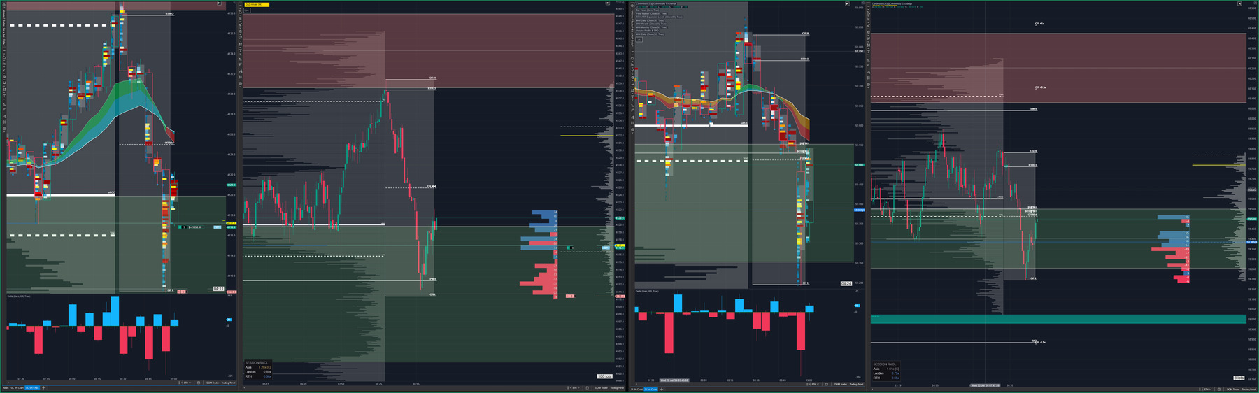
Figure 5. The turn, Gold above and Silver below. Both instruments have rejected the lower prices and are working to regain access inside the node. On Gold, the footprint heatmap shows volume transacting through the lower edge rather than being rejected immediately back beneath it. The five-minute delta histogram flips positive as initiative buying enters the recovery. On the leg-to-leg delta profile, negative delta remains concentrated in the price bins below the break while positive bins begin building progressively higher. That separation is the visible shift from defence to intent. Silver is attempting the same sequence, recovering references from beneath and moving back toward the lower edge, but its confirmation remains later and less complete.
The distinction that turns this from an observation into a decision is narrow and it is the most useful idea in the piece.
A bid that holds the low is defending. It absorbs what is thrown at it and prevents further downside, and that is genuinely information, but it is passive information. It tells you someone is unwilling to let price go lower. It does not tell you anyone wants it higher.
A bid that starts transacting at progressively higher prices is doing something else. It is not waiting to be filled. It is paying progressively higher prices, showing that buyers are no longer willing to wait at the low. Holding a level is defence. Paying more is intent.
Gold reclaiming the upper edge of that node at 4120 was evidence of the second thing rather than the first. It was not simply a bounce from the low. The footprint heatmap showed volume continuing to transact as the market worked back through the area where trade had previously accumulated. Beneath it, the five-minute delta histogram turned positive. On the leg-to-leg delta profile, the negative bins remained beneath the break while positive delta began building in higher price groupings. The offer was no longer merely being absorbed. It was being left behind.
The pivot ribbon supported the read without generating it. Through the press, price had separated a long way beneath it, which is what a genuine flush looks like. On the recovery it compressed and price worked back into it. That is a change in the ribbon's function from separation to compression, and it is contextual structure rather than a signal. Nothing about a ribbon being crossed is a reason to do anything.
This is where the position gets built, and it gets built as a consequence of the read rather than as an event of its own. It was layered rather than committed at once, because at that moment the interpretation was supported and not confirmed. Risk sat at the session low, the last price the sell side had been able to reach. The reasoning is the part worth taking away. The proposition was that the sell side had pressed into the pocket and could not carry the auction through it. Trading back down through that low would mean the proposition was false. The risk location was not a distance chosen for comfort or for a round number. It was the price at which the idea stopped being true.
The opening range and the volatility-scaled expansion levels around it gave the second frame here, a fresh reference built at today's open to sit alongside the ones carried in from prior sessions, and a sense of how far the move was relative to what this instrument normally does in a day.
One thing stayed unresolved. Silver still had not made the forward progress the pre-session note asked for. It had recovered, but it was recovering to its reference from beneath it rather than never having lost it. That question was open at the moment risk was taken, and pretending otherwise afterward would be the kind of retrospective tidying this series exists to avoid.
Part V: Access
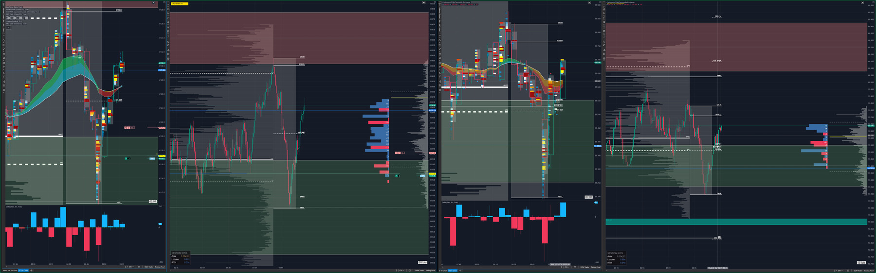
Figure 6. Access through the vacuum, Gold above and Silver below. The key Gold candle closes above the initial offer that flooded into the lows, leaving a low-volume pocket behind. The footprint heatmap shows volume transacting through the advance without price being immediately returned to the lower area. The delta histogram beneath it shifts into strong positive five-minute readings, and the per-price delta shows increasingly large positive prints building higher as price moves through the node and the low-volume pockets, while the earlier negative prints remain beneath the market. Price and aggressive buying are now progressing together. That is what produces the unwind and subsequent cascade of initiating buying. Silver reaches the same confirmation later, reclaiming its point of control and the prior day's high after Gold's move is already underway. Relative volume, still visible in the corner panel, stays close to where it was during the press, confirming the move never picked up broad participation even as it succeeded.
The next thing that mattered was the difference between reaching the thin area and getting through it.
Reaching it proves very little. Price arrives at a low-volume pocket constantly and gets rejected out of it just as often. Gaining access means price moves through the area and the opposing side does not immediately reclaim control on the other side. This time the door swung. A strong green five-minute candle closed above the initial offer that had flooded into the lows, leaving a low-volume pocket behind. The footprint heatmap showed volume continuing to transact as price advanced rather than being rejected back through the opening. The five-minute delta histogram turned strongly positive, and the per-price delta showed increasingly large positive prints developing at higher price groupings while the earlier negative prints remained below.
Price was now progressing with the positive delta rather than merely absorbing negative effort. The lower sell-side prints were being left behind, and the higher positive activity was building with the direction of the auction. That sequence produced the unwind and then the cascade of initiating buying.
That combination, and not the distance price had travelled from entry, is what justified continuing to hold. The initiating side was still being paid. The moment that stops being true, the reason to hold stops with it, regardless of where price sits relative to where the position was built.
Risk came down at a structural location once access had been gained rather than at an arbitrary point, and a portion of the position was removed while the remainder stayed on.
Silver eventually reclaimed its point of control and the prior day's highs, which was the forward progress the pre-session note had been waiting for. The confirmation arrived, and it arrived late. The sequence remained uncomfortable even as the evidence improved.
Participation never expanded, so the recovery could be described as effective within the sequence, but not as broad or strongly sponsored.
Part VI: Where the Evidence Stops
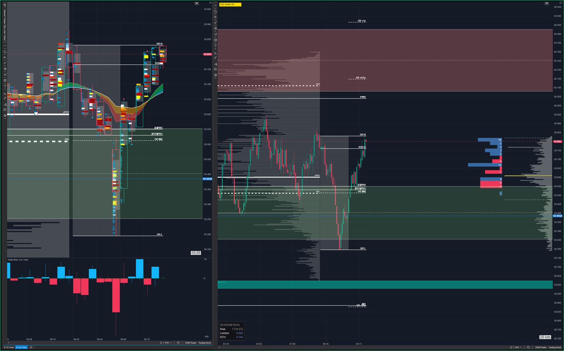
Figure 7. Silver alone, the final documented capture. Price is still moving higher even while the offer continues to press. The footprint heatmap shows volume continuing to transact near the upper reference rather than disappearing. The five-minute delta histogram remains positive, but the response is smaller and more mixed than during the earlier recovery. On the leg-to-leg delta profile, positive delta bins are still building higher, but negative bins are now appearing alongside them and the same effort is producing less price progress. That is the fragility visible in the image. The next upside attempts need to see initiative buying rewarded with follow-through, or the quality of the move continues to deteriorate. No Gold capture exists at this point in the sequence, which is why the piece ends on Silver rather than on a resolution.
The last piece of information in the sequence is a deterioration rather than a reversal, and it showed up first on the weaker instrument.
Silver worked back up to the area where it had already failed once, around its own session open and the upper edge of the opening range. The five-minute delta response remained positive, but the bars were smaller and less consistent than they had been through the recovery. On the leg-to-leg delta profile, positive bins were still developing at higher prices, but negative bins were now appearing alongside them. The footprint heatmap showed business continuing to transact near the offer, while price produced less progress from that effort. The buying had not stopped. It had stopped converting.
Price was still moving higher while the offer continued to press. That is not yet rejection, but it is a more fragile structure. The next initiating attempts needed to produce renewed progress, otherwise the relationship between effort and result would continue deteriorating.
That is the same principle the piece opened with, running in the other direction. Earlier, aggressive selling failed to produce downside progress and that mattered more than the size of the selling. Here, buying continued to appear and produced progressively less. The direction of delta is the least interesting thing about it. The ratio of effort to result is where the information lives.
Watch the sequence unfold
Watch three relationships as the clip runs: sell-side aggression staying visible while downside progress starts to fail, the bid first holding the low, then the bid transacting at progressively higher prices. The clip runs past the point of entry into the management that followed, so the response stays visible rather than cutting on the decision itself.